Mother
Mother
Client
Mother
Services
Branding, Motion
Client
Mother
Services
Branding, Motion
Studio Size designed the visual identity for Mother, a 100% woman-owned creative production studio from Belgrade, specializing in producing high-quality digital content and TVCs. Our goal was to create a compact, timeless, and adaptive brand identity that engages clients and stands out in the industry. We focused on developing a brand system that captures Mother’s creativity while maintaining a professional and trustworthy image. The design reflects their innovative spirit without being overly experimental, ensuring it resonates with B2B clients who value stability and reliability in their partners.

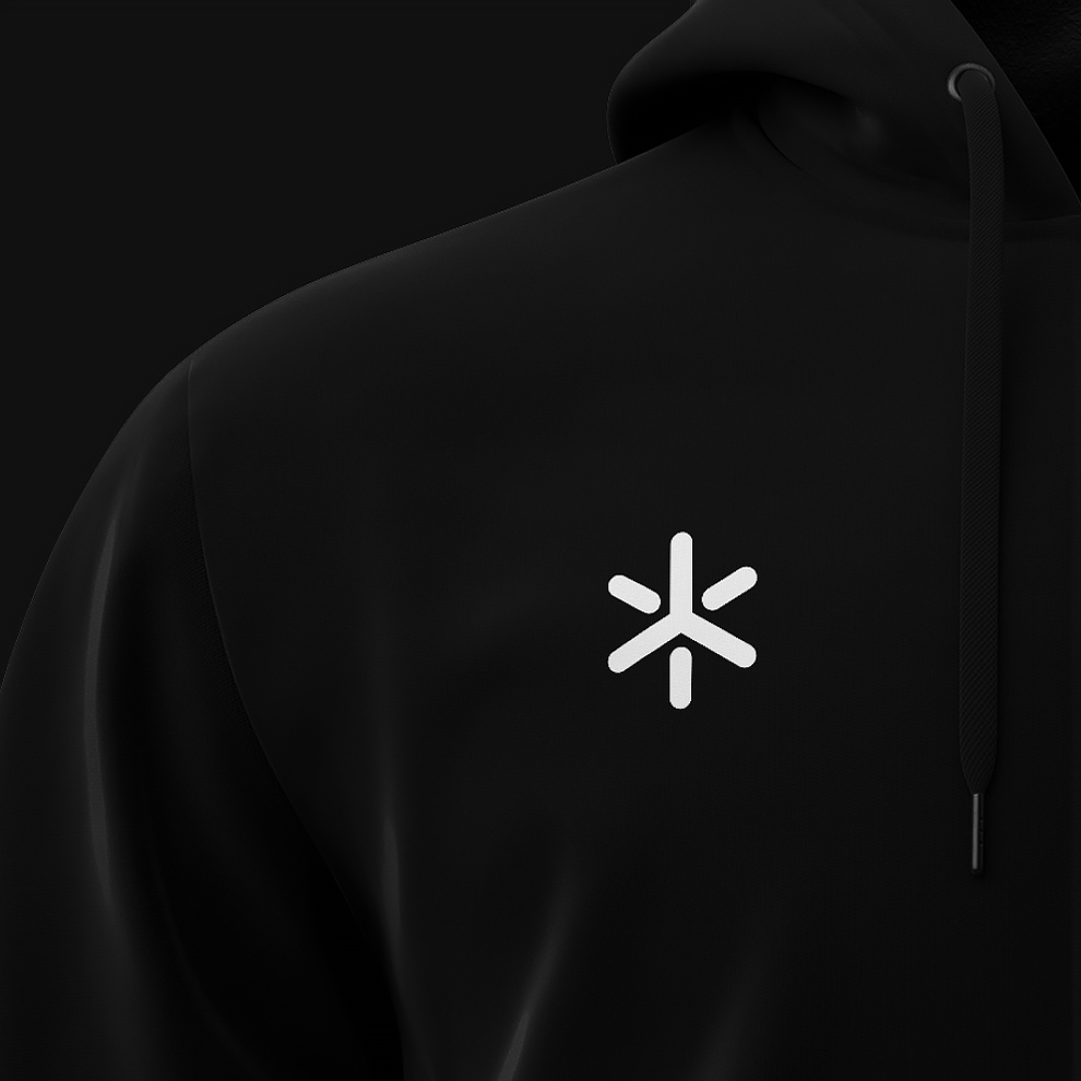
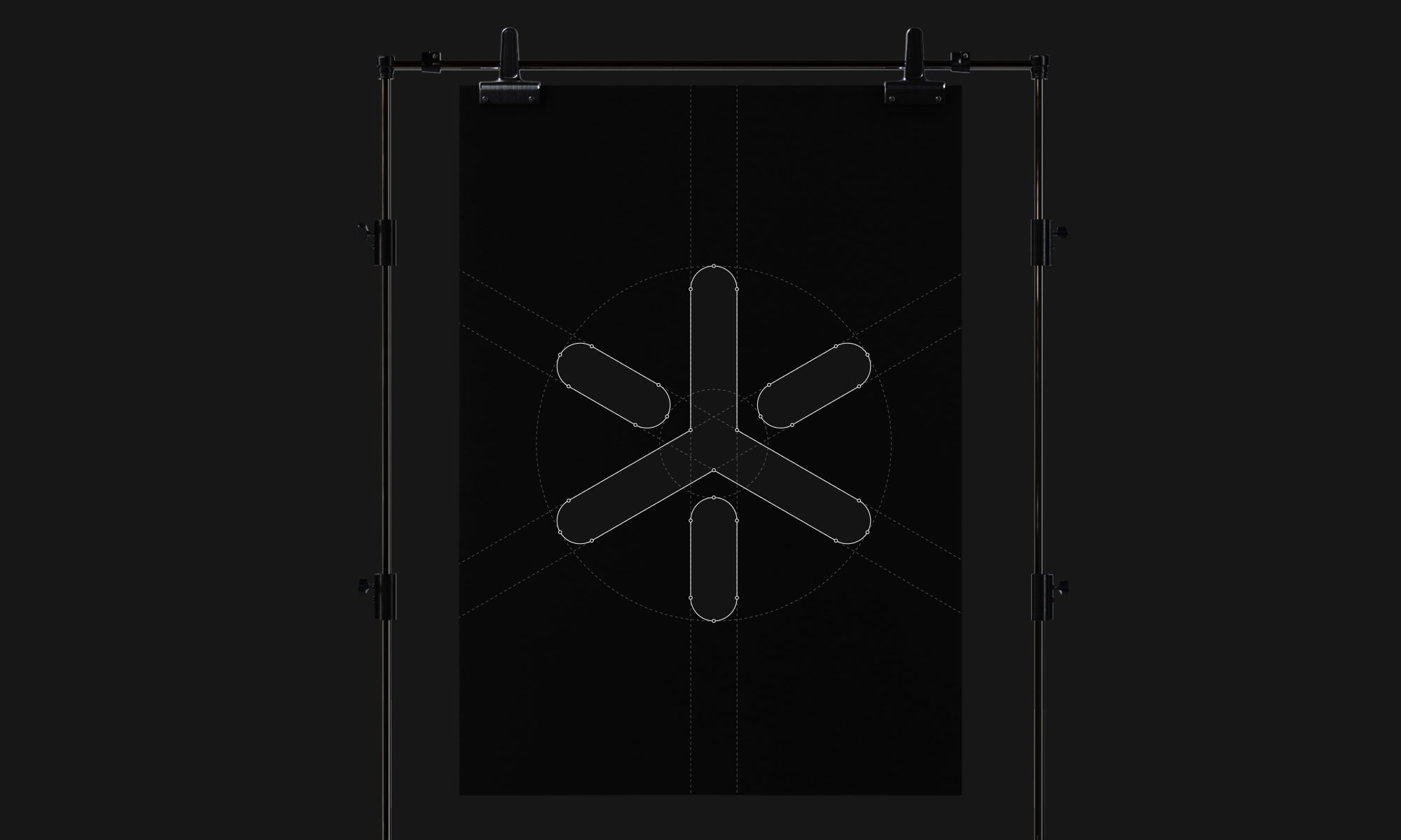
Logo

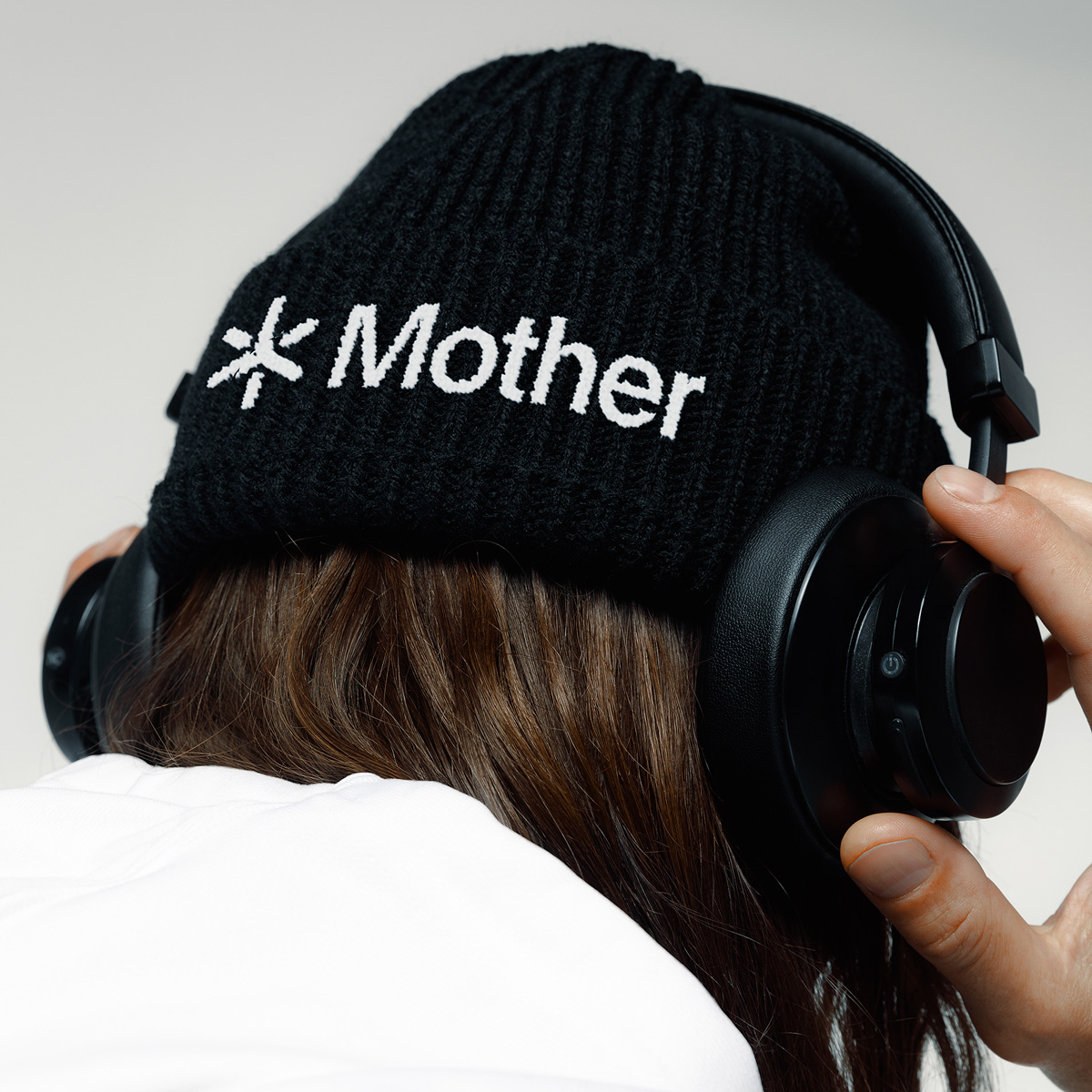
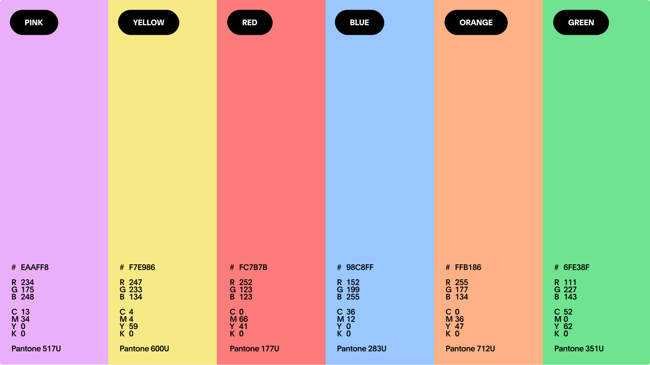

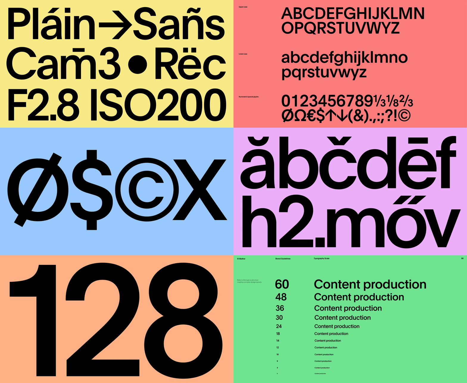
We designed a vibrant color palette that can be paired in various combinations, enhancing usability and allowing the visual identity to adapt seamlessly to different case study presentations. The rich palette also reflects the agency’s creativity.
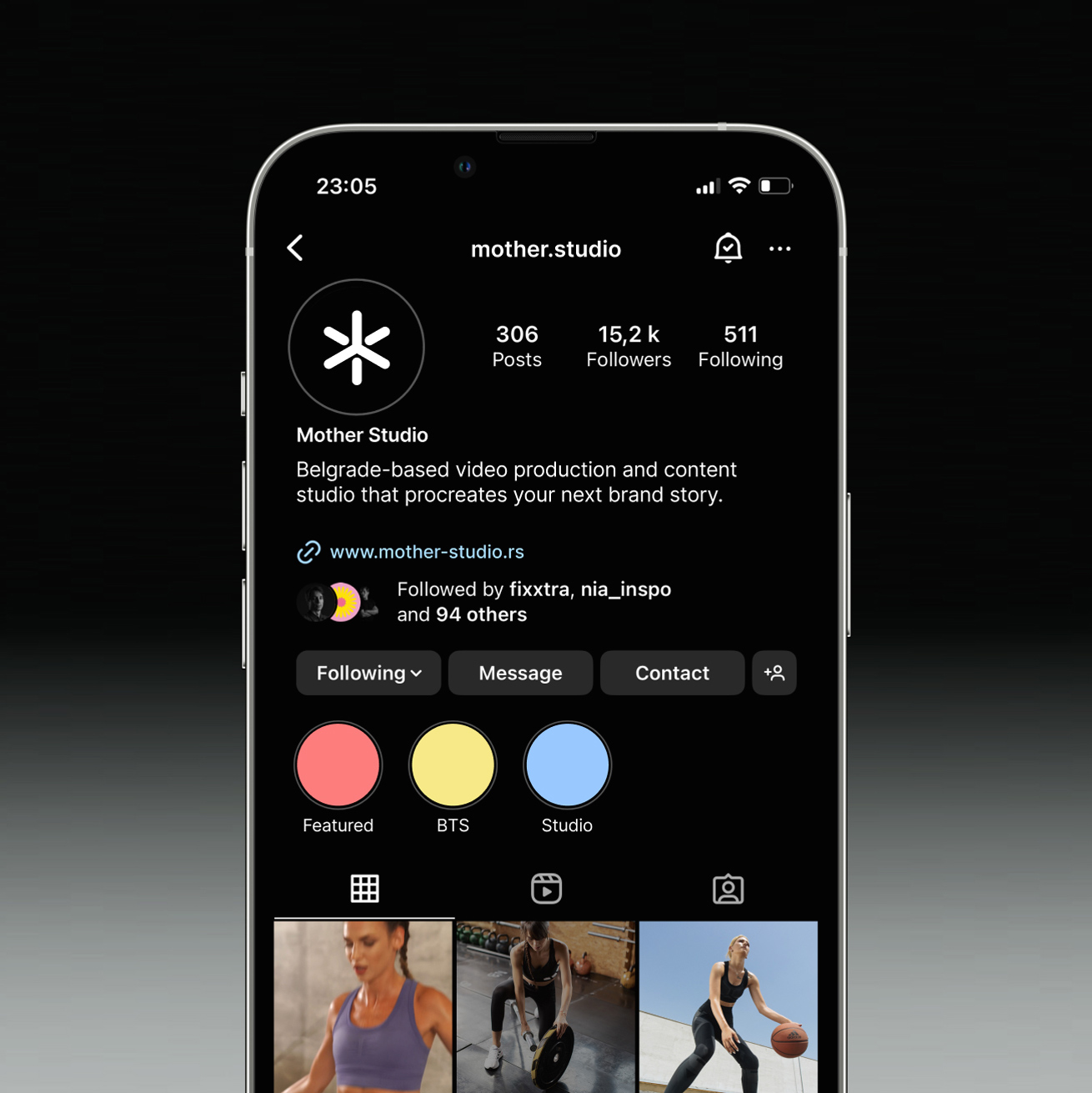
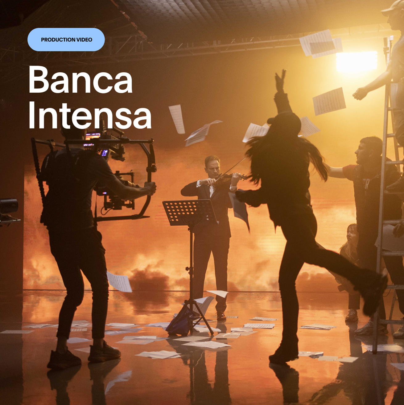
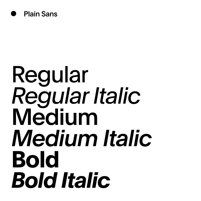

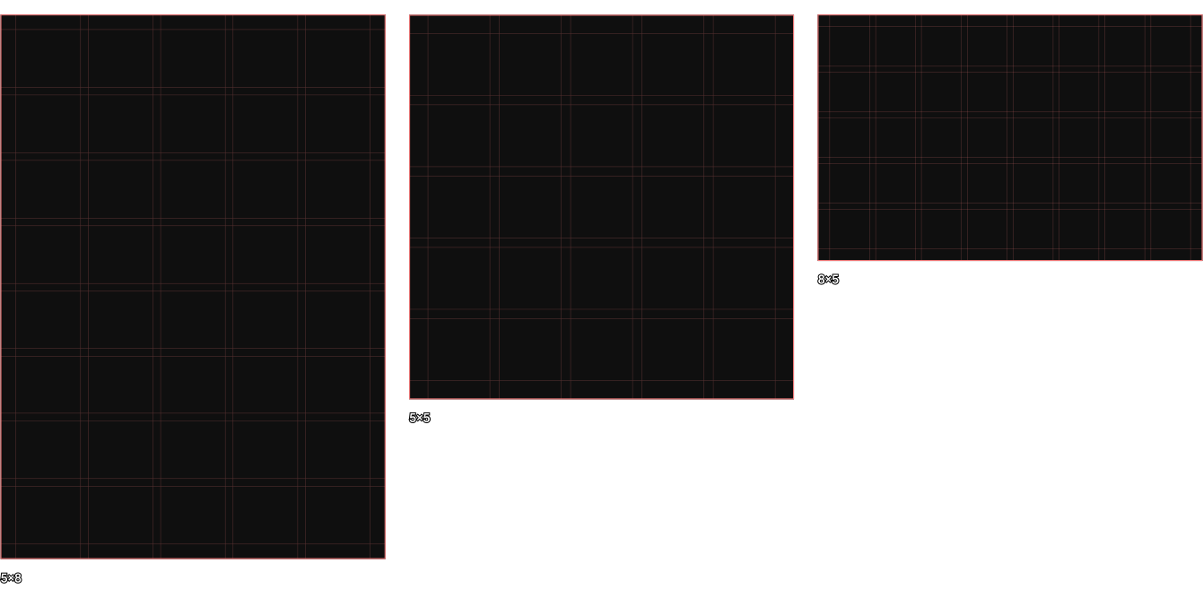
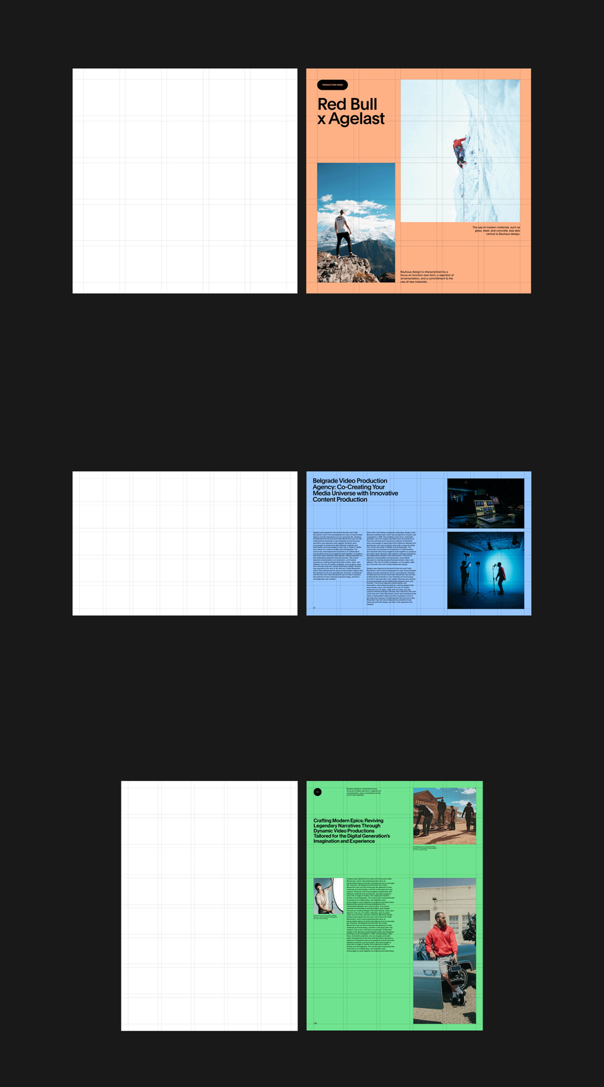
The UI design elements are directly connected to the logo, incorporating rounded corners, which are a key feature of its design. Our aim was to expand the brand’s visual identity into the digital sphere, ensuring coherence and consistency across all media.
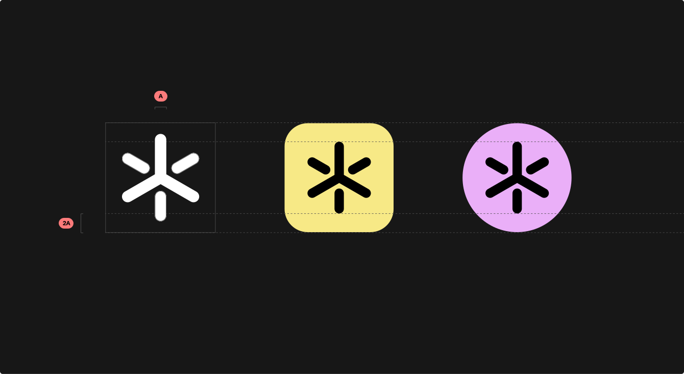
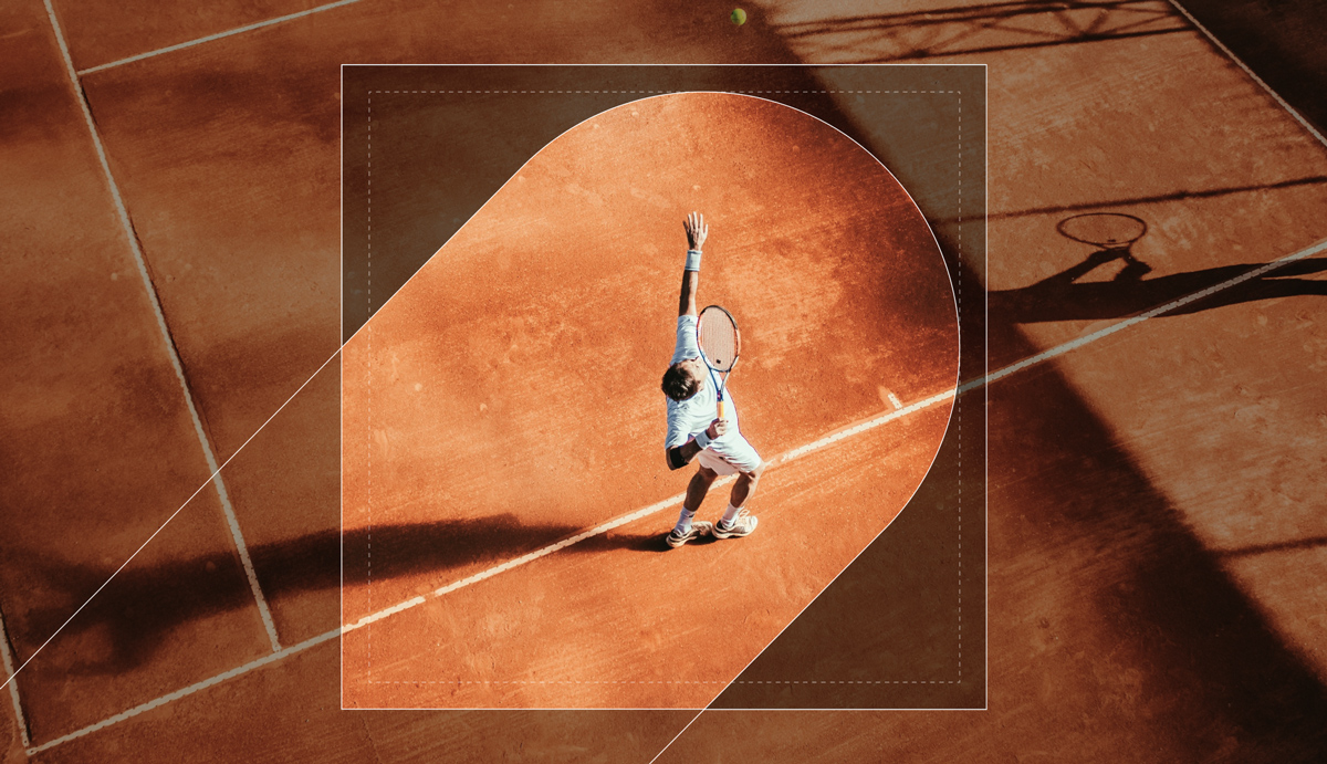
We developed a design system derived from the core elements of the brand, such as the logo. As part of this system, we created secondary design elements, including masks, which are enlarged sections of the logo. These elements allow for greater flexibility while maintaining a cohesive visual identity across various applications.

Featured Work
Featured Work