Customize Consent Preferences

We use cookies to help you navigate efficiently and perform certain functions. You will find detailed information about all cookies under each consent category below.

The cookies that are categorized as "Necessary" are stored on your browser as they are essential for enabling the basic functionalities of the site. ... 

Always Active

Necessary cookies are required to enable the basic features of this site, such as providing secure log-in or adjusting your consent preferences. These cookies do not store any personally identifiable data.

Functional cookies help perform certain functionalities like sharing the content of the website on social media platforms, collecting feedback, and other third-party features.

No cookies to display.

Analytical cookies are used to understand how visitors interact with the website. These cookies help provide information on metrics such as the number of visitors, bounce rate, traffic source, etc.

Performance cookies are used to understand and analyze the key performance indexes of the website which helps in delivering a better user experience for the visitors.

No cookies to display.

Advertisement cookies are used to provide visitors with customized advertisements based on the pages you visited previously and to analyze the effectiveness of the ad campaigns.

No cookies to display.

Other uncategorized cookies are those that are being analyzed and have not been classified into a category as yet.

No cookies to display.

PLAY REEL
Drag
Buy Assets
Copy to Clipboard

Salud

Client

Salud

Services

Branding, Website, Motion

Client

Salud

Services

Branding, Website, Motion

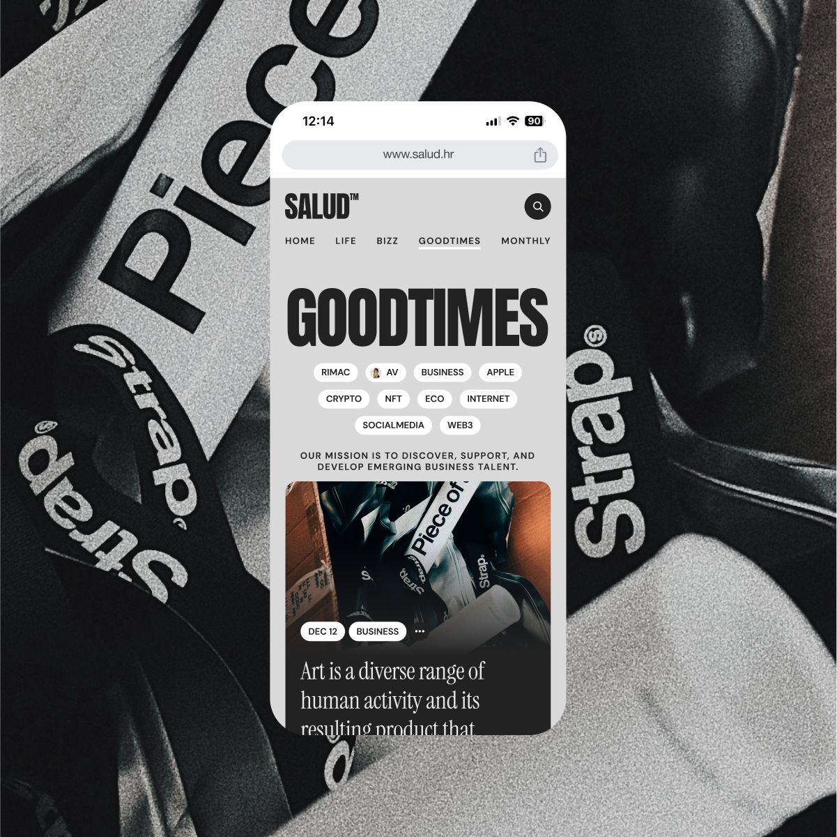
Salud is a digital magazine for modern reflection, a place where stories unfold slowly and with intention. Inspired by the tactile world of printed newspapers, we designed a visual identity & website that translates analog warmth into a contemporary web experience. The goal was not to replicate the past, but to borrow its texture: off-whites instead of whites, washed-out blacks instead of true black, and a rich typographic system that makes reading feel like a ritual. It’s a space that breathes, invites, and never rushes. A digital publication that feels human.
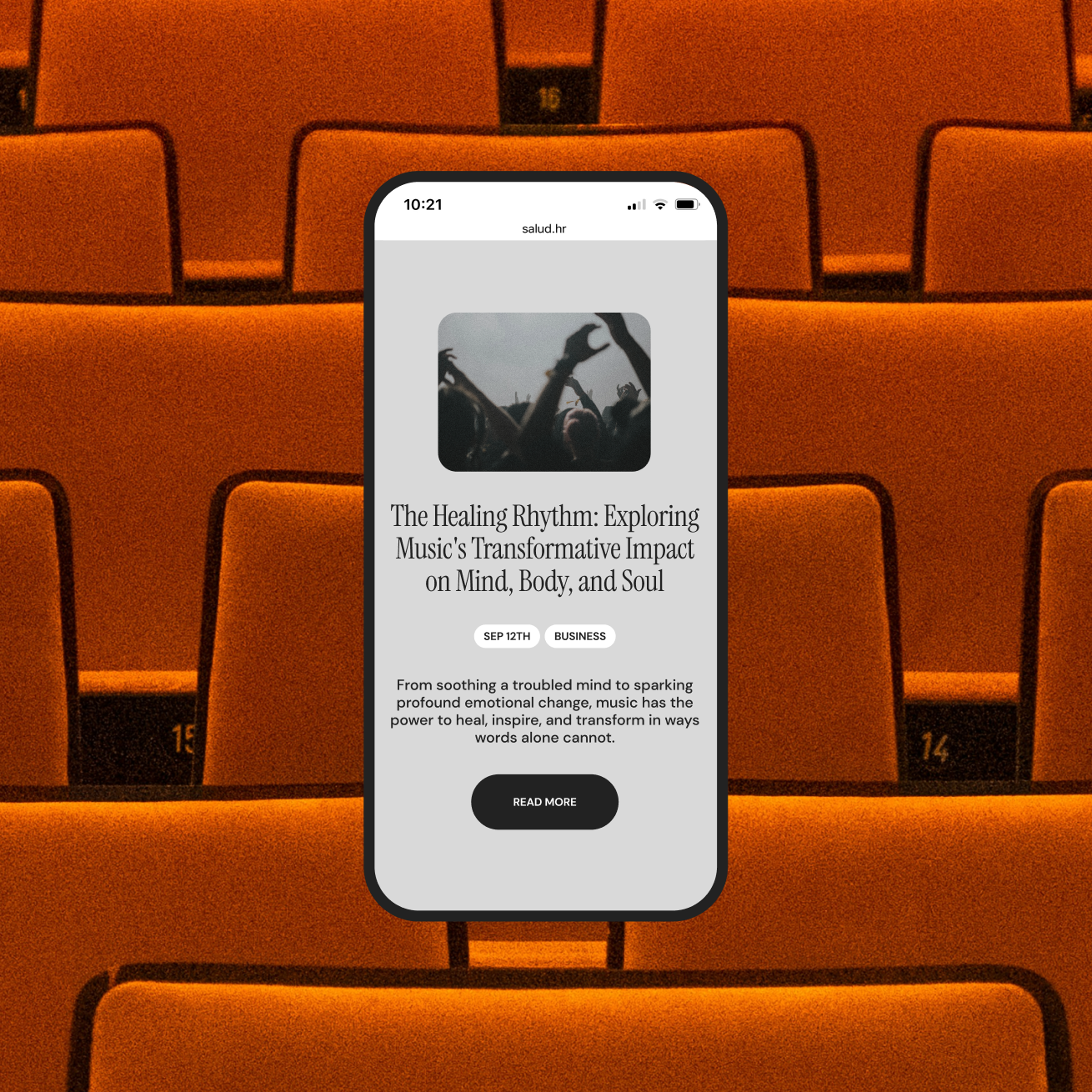
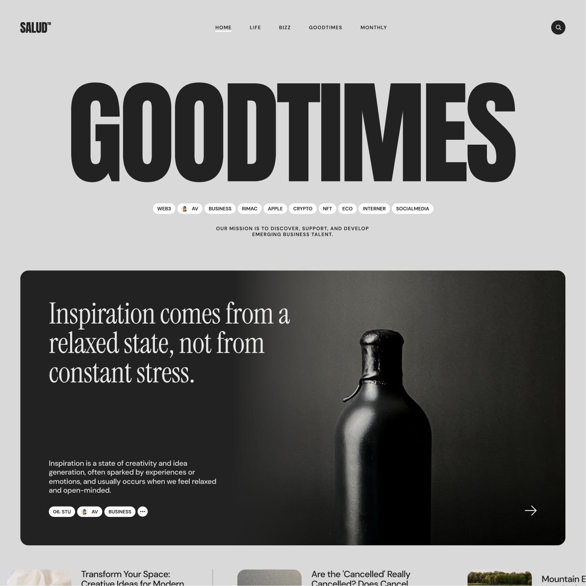
The color palette is a nod to analog paper. Black is never fully black. White is always off-white, like a page under sunlight. In a sea of sharp digital interfaces, this brings a sense of warmth that sets Salud apart from most digital magazines.

Typography
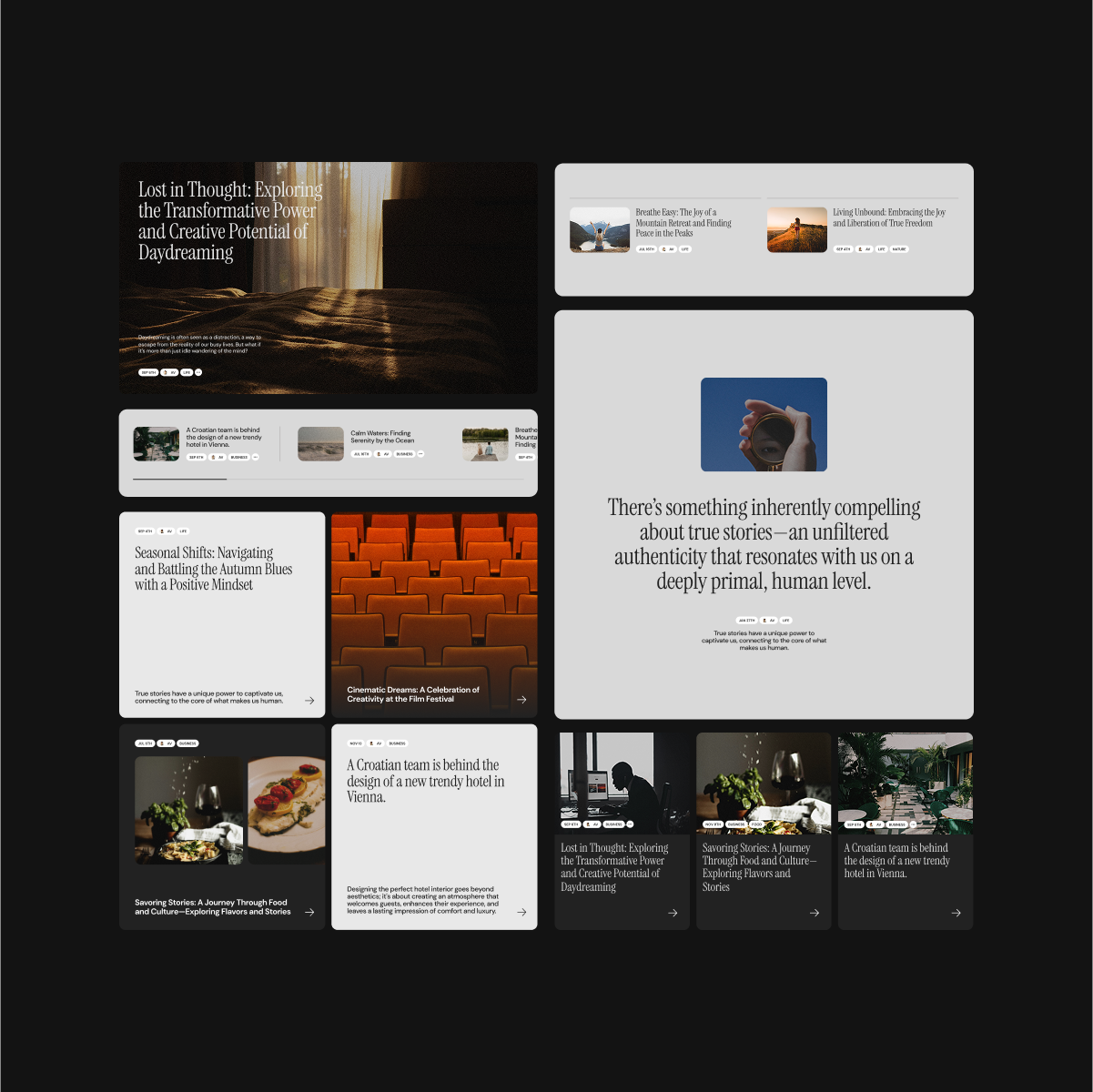
Headlines are oversized, drawing the reader into focus, while body copy sits in a classic editorial grid with generous whitespace. The combination avoids sterility and creates rhythm and mood. It’s a system that respects the act of reading.

UI

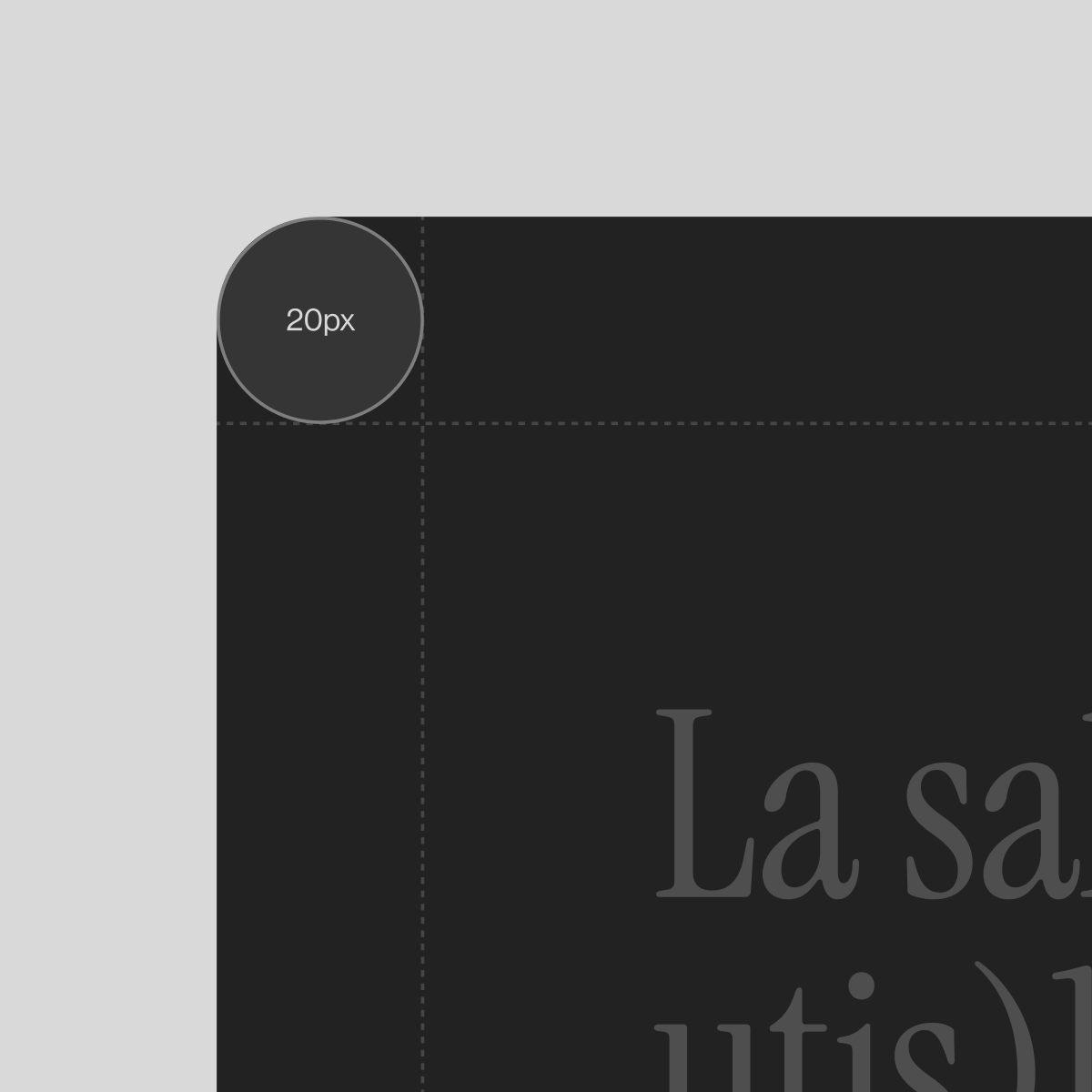
The UI bridges analog motifs and digital function. Structured around a familiar 12-column grid, the layout bends just enough to breathe. Oversized components, rounded corners and spacious breaks create a rhythm that feels curated, not coded.
Tags are more than simple descriptors. They form a subtle navigation layer, turning the magazine into a network of thoughts. Readers are encouraged to wander, to loop, to connect articles by theme or mood. The tag system becomes both map and invitation.