Emilie Aubry
Director's cut
We use cookies to help you navigate efficiently and perform certain functions. You will find detailed information about all cookies under each consent category below.
The cookies that are categorized as "Necessary" are stored on your browser as they are essential for enabling the basic functionalities of the site. ...
Necessary cookies are required to enable the basic features of this site, such as providing secure log-in or adjusting your consent preferences. These cookies do not store any personally identifiable data.
Functional cookies help perform certain functionalities like sharing the content of the website on social media platforms, collecting feedback, and other third-party features.
Analytical cookies are used to understand how visitors interact with the website. These cookies help provide information on metrics such as the number of visitors, bounce rate, traffic source, etc.
Performance cookies are used to understand and analyze the key performance indexes of the website which helps in delivering a better user experience for the visitors.
Advertisement cookies are used to provide visitors with customized advertisements based on the pages you visited previously and to analyze the effectiveness of the ad campaigns.
Other uncategorized cookies are those that are being analyzed and have not been classified into a category as yet.


Client
Solfeggio
Brnding, Motion
Client
Solfeggio
Services
Branding, Motion
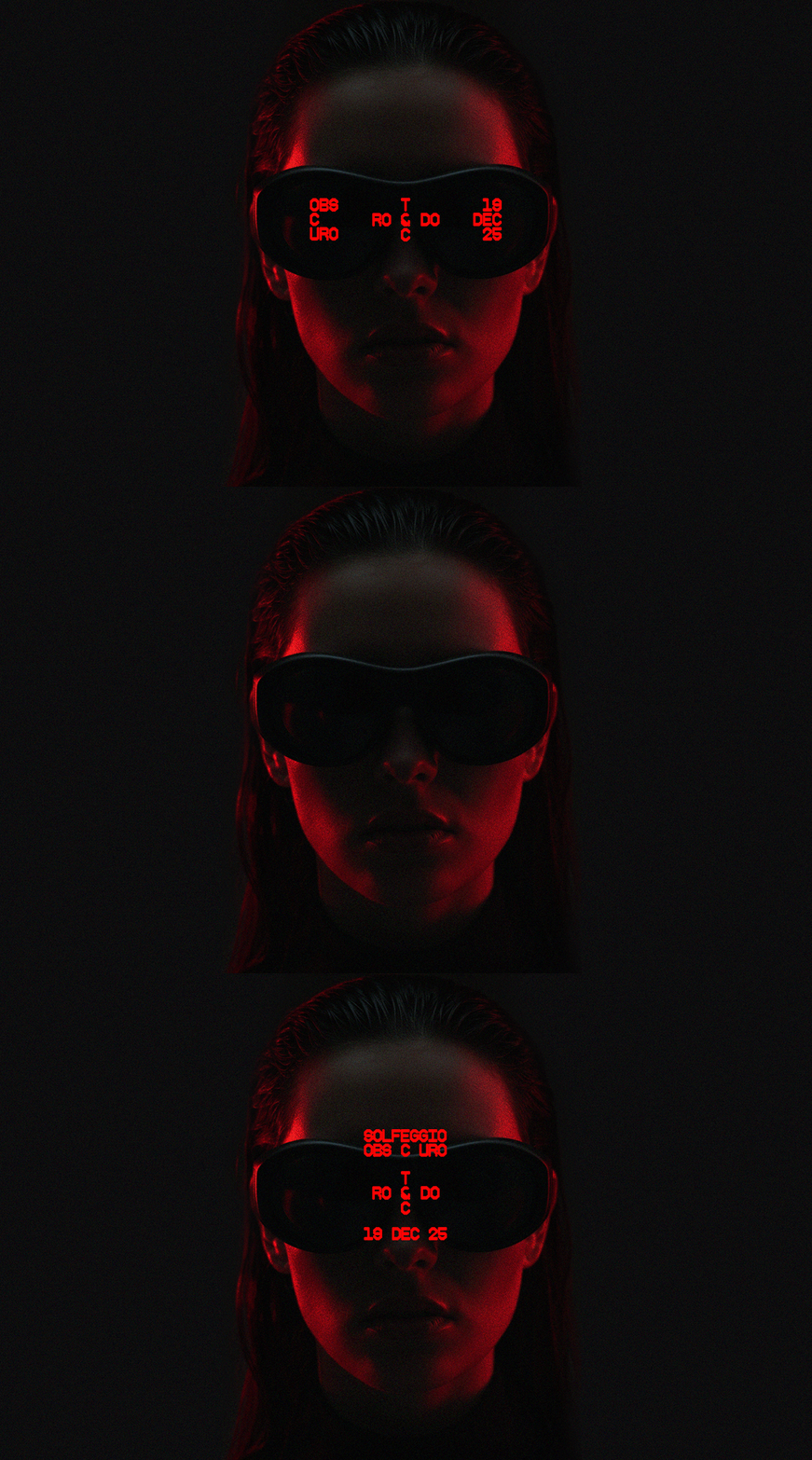
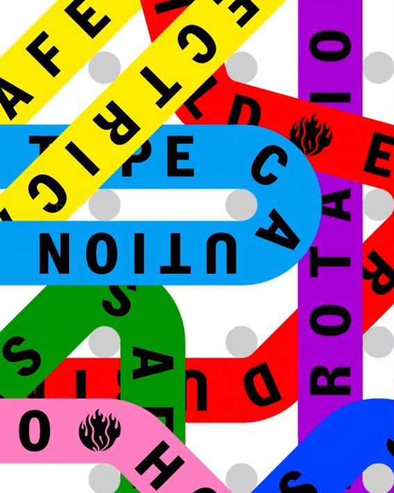
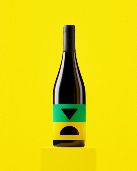
Solfeggio Obscuro is an underground music event with a distinct visual identity built around atmosphere and restraint. For its second edition, we took the aesthetic further. Darker, rawer, more reduced. Inspired by the word “obscure” itself, something primitive and unrefined, yet still intriguing. With custom typography and color as the only core elements, the minimalism holds back just enough to draw you in.